Product/ UX Designer
Cantor
Cantor Arts Center at Stanford puts on events its members never hear about. I volunteered there for a year, from July 2024 to July 2025, saw the problem up close, and designed the app that would tell them — a self-initiated concept.
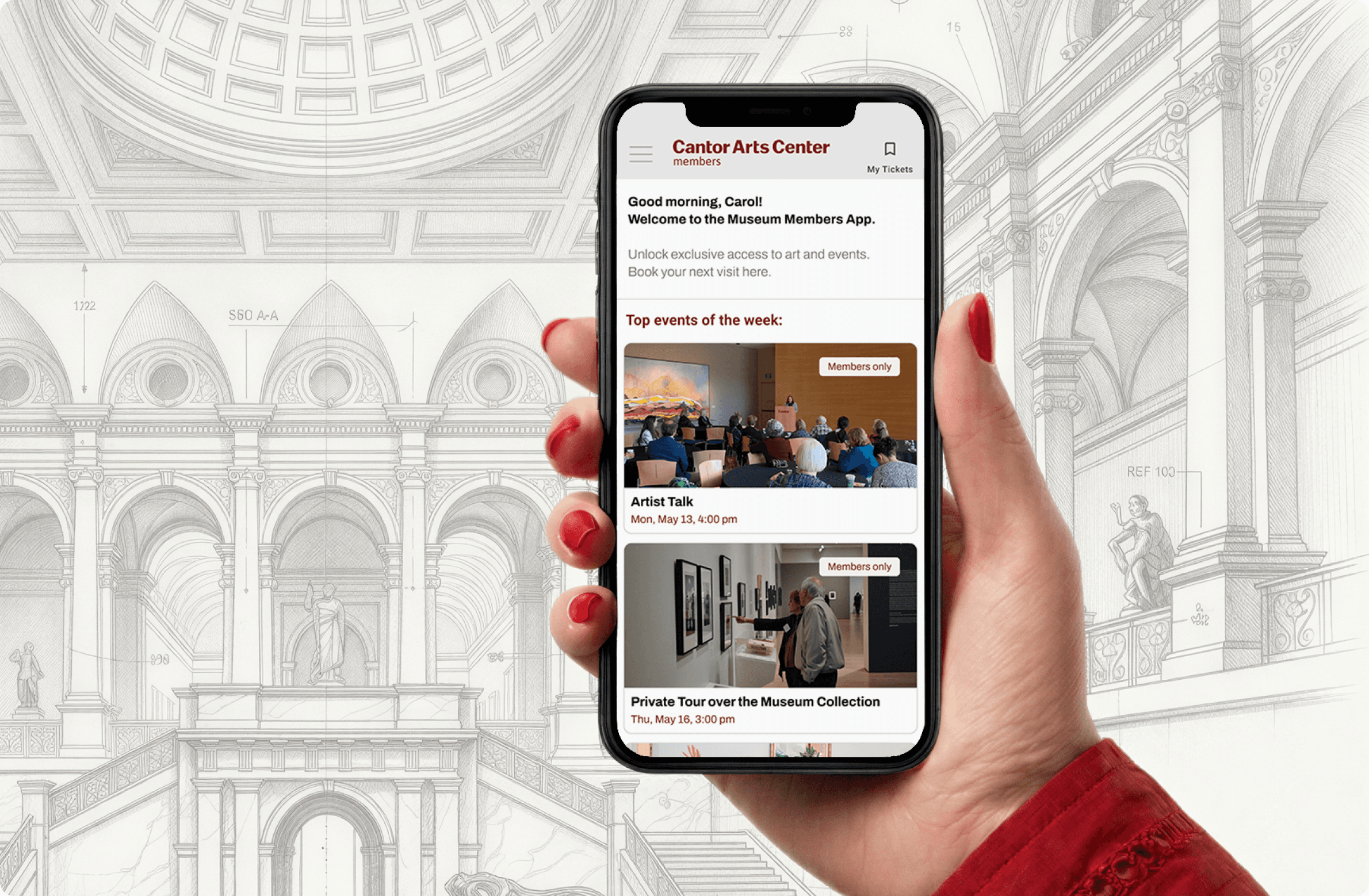
Long story short
I volunteered at Cantor for a year and watched the same thing every month: the team put on member-only events, and members found out too late or not at all. There were two ways to hear about them — a newsletter that went unread, and the reception desk.
Five interviews turned up three walls. Senior members don’t check email; younger ones are drowning in it. Tickets could be bought through a newsletter link or in person, and nowhere else. And nothing anywhere simply listed what was coming.
Services
Tools
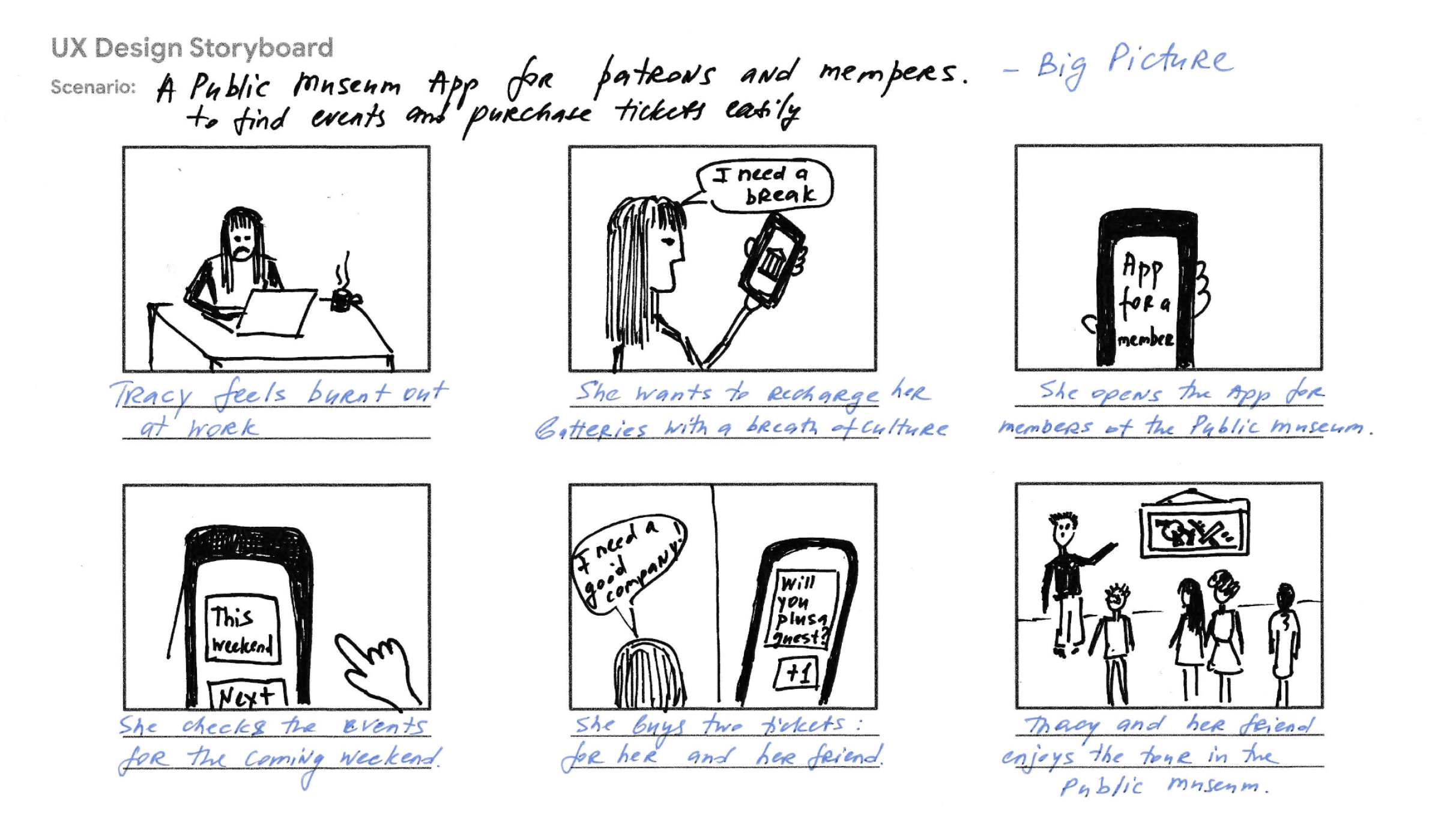
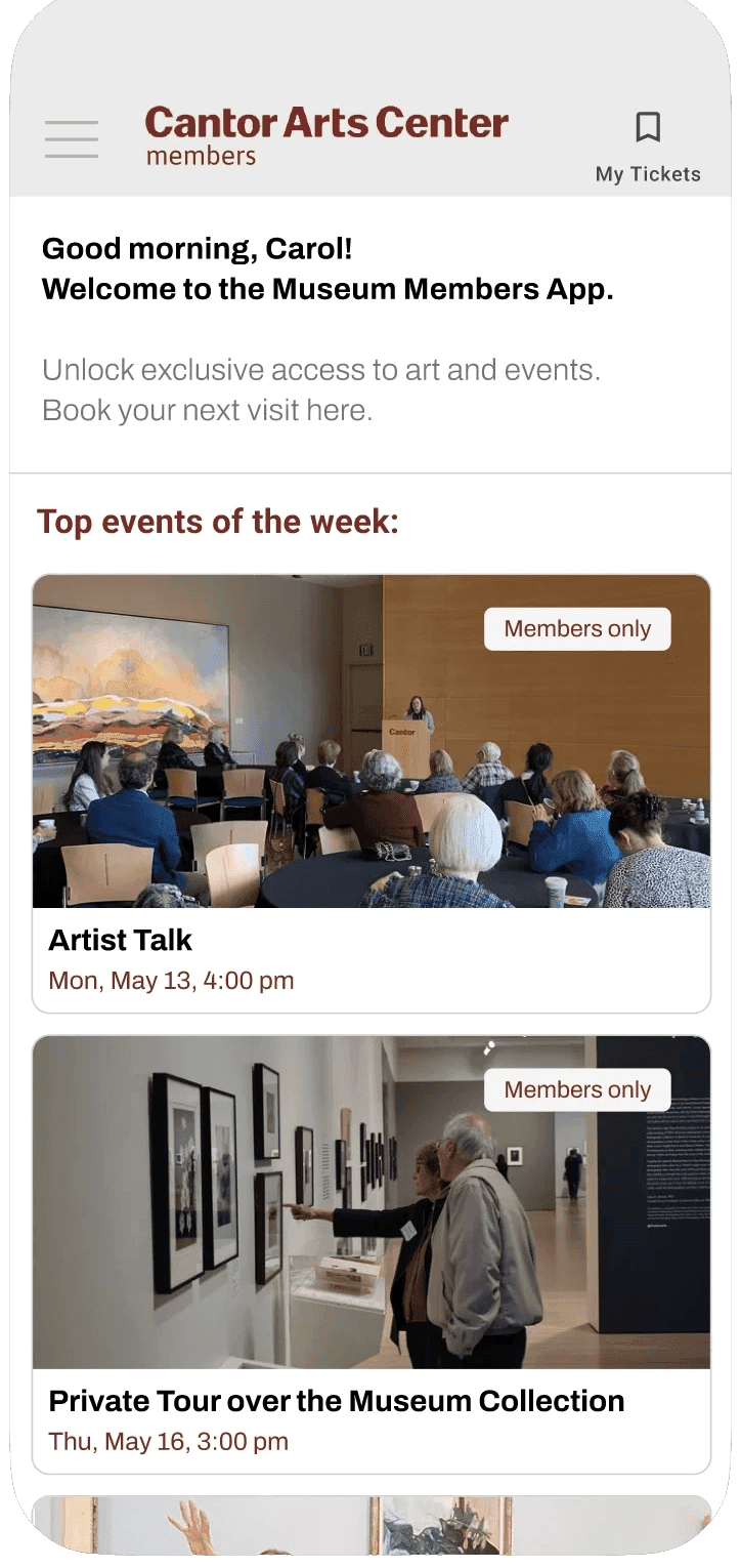
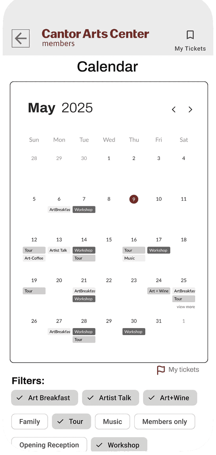
So the app answers “what’s on” three different ways, because people asked it three different ways: a month list, a type filter, a calendar. Any one of them would have been cheaper to build. Dropping two would have quietly served a third of the people I spoke to.
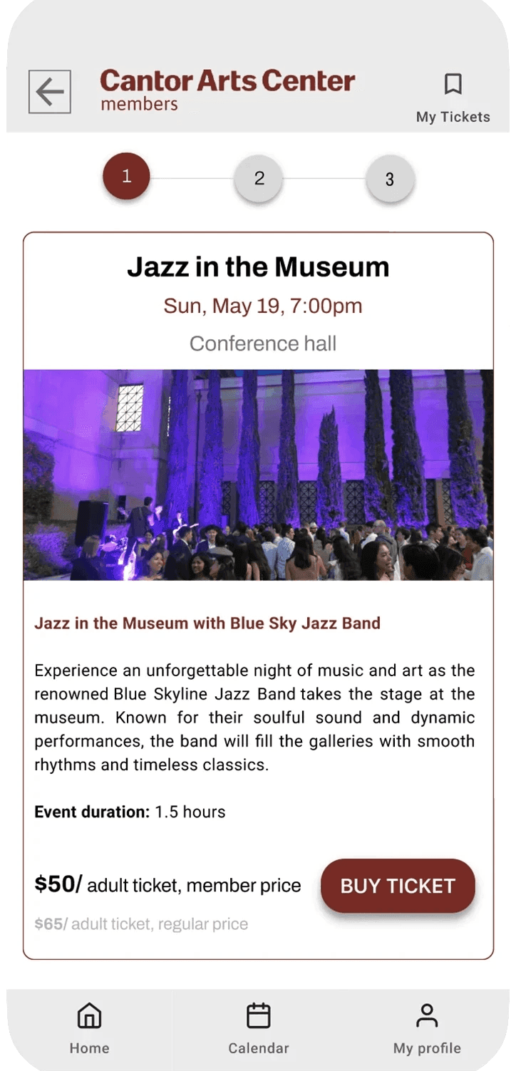
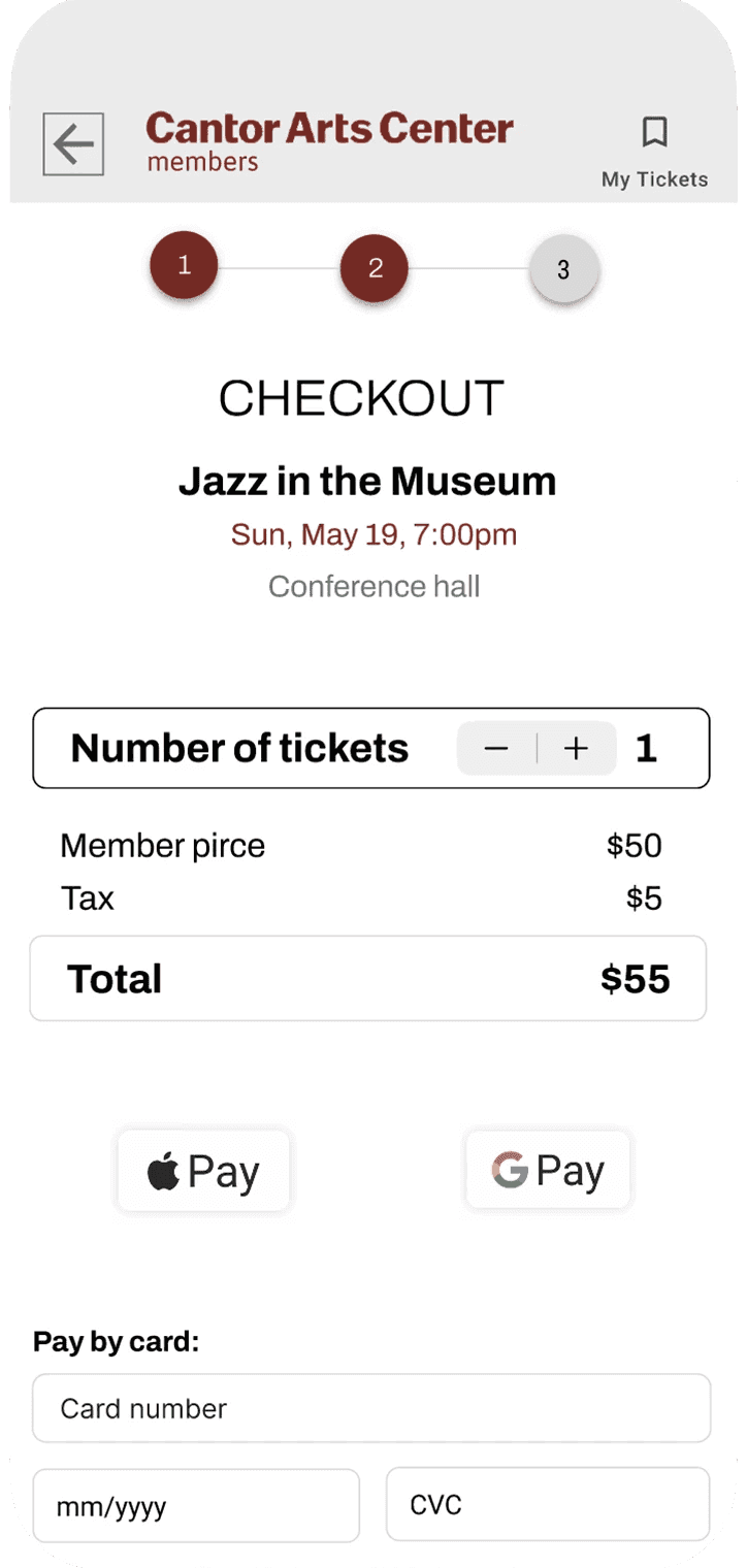
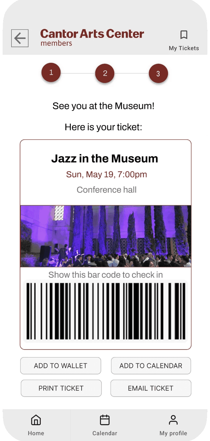
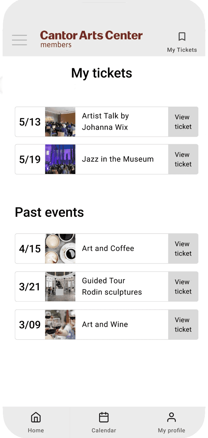
Two rounds of testing changed it. The type filter moved onto the home screen. Apple Pay went ahead of card entry, because that is the order people reach for. And the confirmation screen stopped being a dead end. Seven screens end to end, validated by the people it was for — and then it stopped, because there was nobody to build it.
HI-FI PROTOTYPE